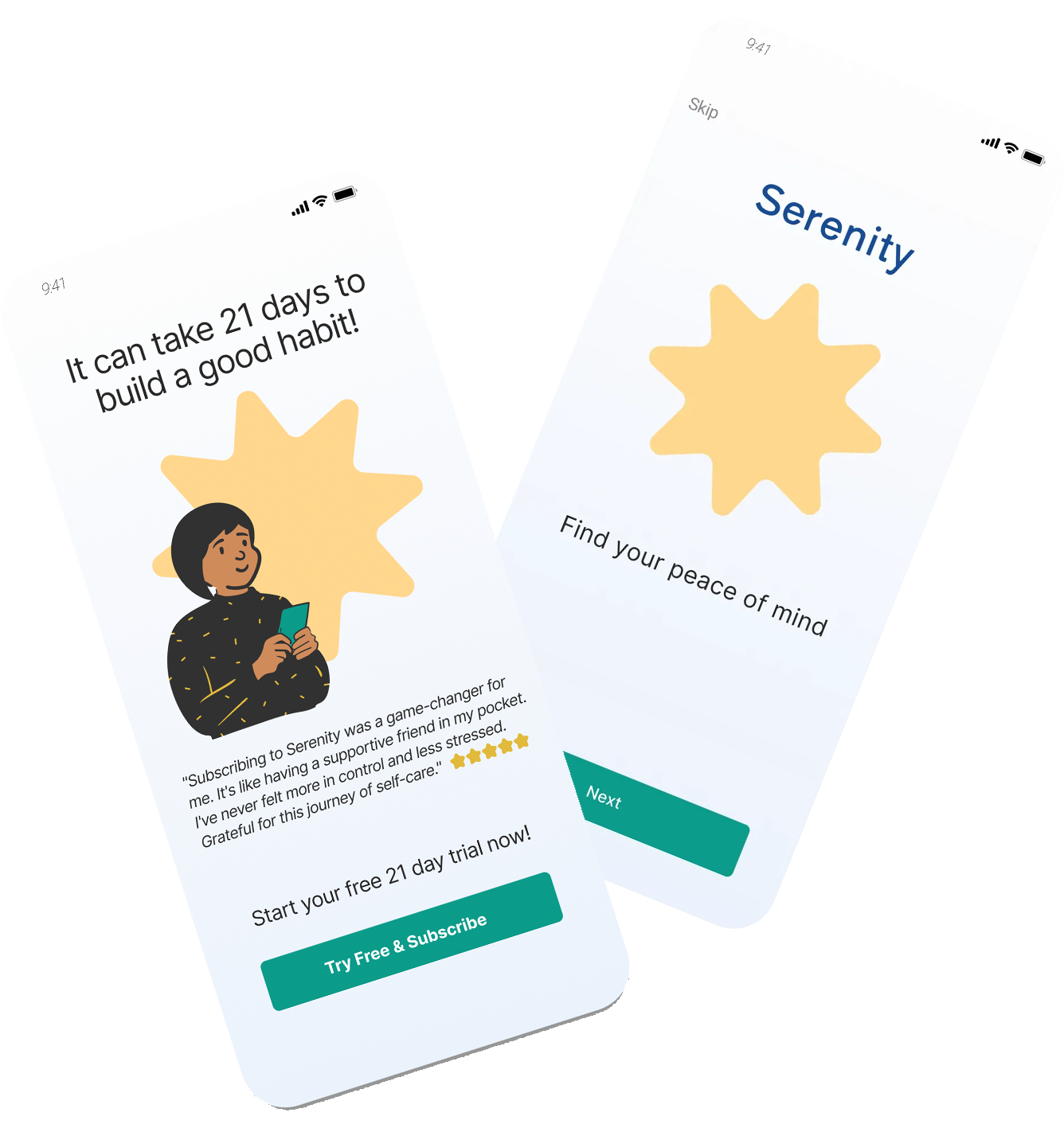
A/B Test Ready Shopping Layouts
Designing A/B test-ready layouts to improve clarity, trust, and conversion on a mattress comparison website.

Mattress Shoppers Deserve a Comfy Experience


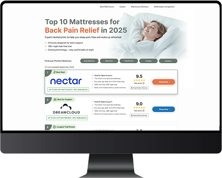
The Situation — Top Mattresses — PPC Page Redesign
The Top Mattress website needed a redesigned page to improve engagement and click-through rates for PPC traffic. Research showed that key decision drivers like back-pain relief, trial length, and delivery options were buried in the existing layout, creating friction and low clarity. The current page felt generic and visually flat, particularly on mobile, making it difficult for users to confidently compare options. The team set out to create a more emotionally engaging, trustworthy, and comparison-friendly experience through a full layout overhaul.
Role: UX/UI Designer
Duration: 6 weeks
Goal: Redesign the mattress comparison experience to improve clarity, emotional resonance, and click-through rates
Outcome: Three unique layout directions developed for A/B testing and stakeholder review
Key Contributions: User-aligned concept development, layout + component redesign, visual direction, stakeholder collaboration, desktop-first responsive build
Overview/TL;DR
Redesigned a mattress comparison experience to increase clarity, emotional resonance, and mobile engagement for women aged 45–65, creating three new responsive layout directions and preparing two for A/B testing, especially mobile.
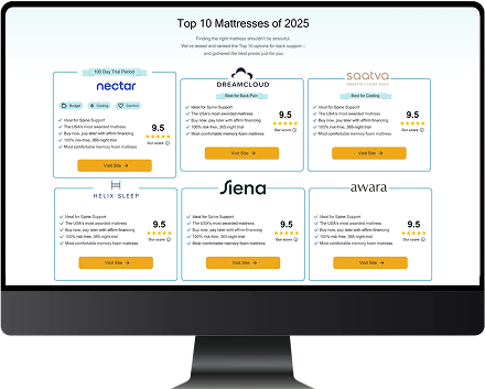
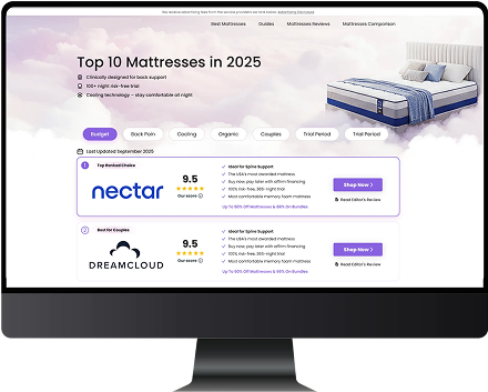
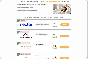
-Reimagined the comparison chart structure to prioritize clarity, trust, and above-the-fold value
-Designed 3 distinct concepts (Hero-Led, Cards-First, Open-Concept creative direction) across desktop + mobile
-Elevated key conversion drivers (back pain relief, trial length, delivery/setup, trust badges, clear CTAs)
%201.png)
Why this redesign was needed
The PM requested a new comparison page layout to improve engagement and click-through rates
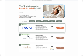
Research showed women aged 45–65 respond most to clear value benefits like back-pain relief, home trial length, and delivery time and fees and difficulty of set up.
The existing layout felt generic and buried these key decision drivers, especially on mobile.
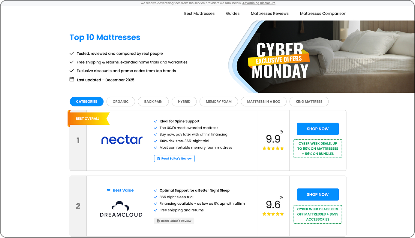
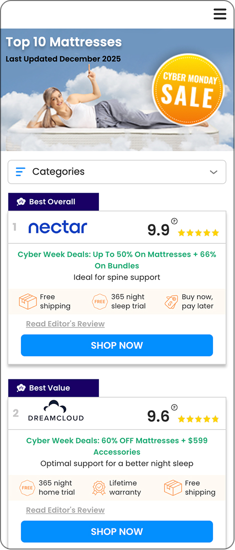
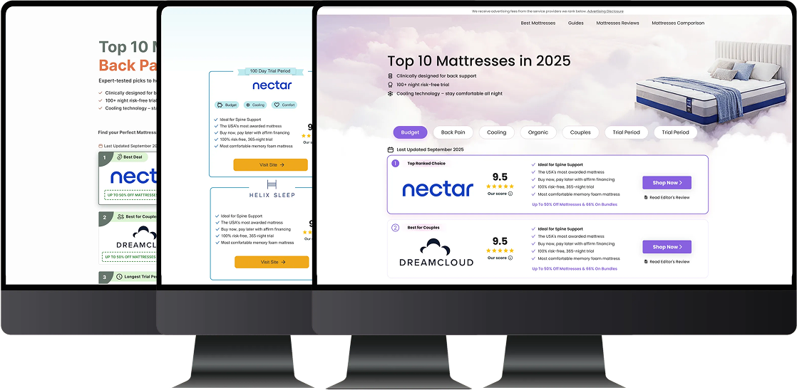
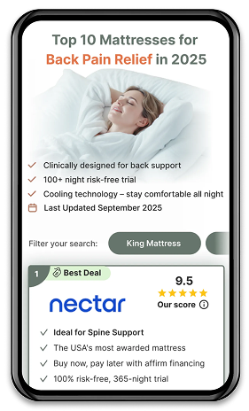
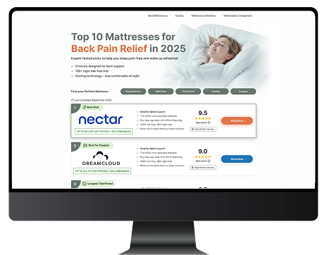
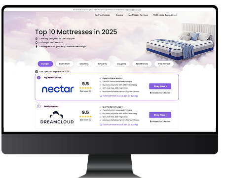
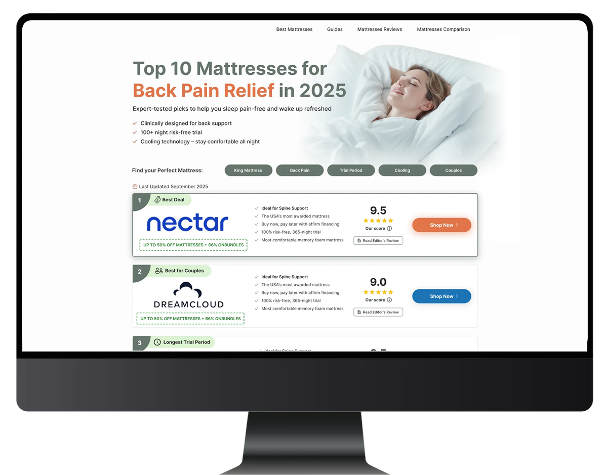
Three concept directions delivered
I designed three distinct comparison-page concepts based on the brief.
a) Soothing, inviting color palette (greens, neutrals), large hero with strong benefit driven headline, calming imagery
b) Grid or stacked card layout, visual parity between products, minimalist layout, no big hero straight to the point: scan, compare, decide
c) Designer’s choice - suggested lavender colour pallette
Each concept was built fully for desktop, then adapted into mobile versions.
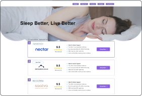
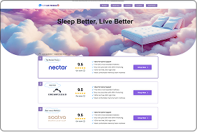
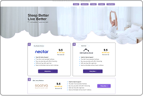
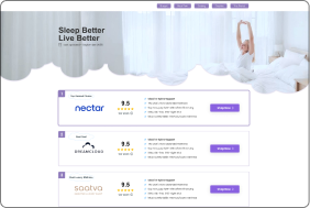
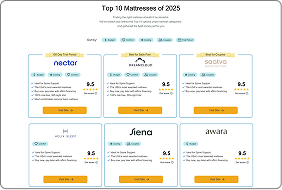
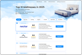
After multiple design iterations, these are the three final concepts presented for stakeholder review:
A
B

C
A/B Testing Direction - From Three to Two
The filter-based version was de-prioritized early.
We moved forward with the clean layout and the more colorful, expressive layout.
Both were prepared for A/B testing across devices.


Expected Impact and Lessons Learned
Improve clarity and build confidence to take action.
Increase click-through rates, scroll depth, and comparison engagement.
Make it easier to trust brands and choose with confidence across all devices.
My Key Takeaways: